
Hello, I'm
Roberto Perez.
I design with scalable,
and measurable impact.
Currently Senior Design Specialist at Digital NEST.
Prevously at Indy Pixels ,H&R Block, USAA, Sam's Club, eBay, ABM Industries, Facebook, and Shopkick.Driven by curiosity, I embrace emerging technologies and continue developing new skills, especially in AI powered tools and workflows, to push the boundaries of innovation. Outside of design, I find inspiration in photography, reading, biking, and spending quality time with my family. These interests shape how I think, create, and approach problem solving.

Select Work

Driving clarity and conversion
Redesigned the homepage to clearly communicate value and improve usability, supporting key business and conversion goals.

Advancing equity in sports
Launched a national campaign for H&R Block that elevated female athletes, increasing visibility, brand trust, and public endorsements.

Unifying brand experience
Refreshed storefront using a unified design system and cohesive content, delivering a consistent and scalable digital brand presence.
Skillsets

Design Tools
Figma, Adobe Creative Suite (Illustrator, Photoshop, InDesign), After Effects, Lottie, Frontify, Miro, Squarespace, Framer

Product UX/UI
User Experience (UX) Design, User Interface (UI) Design, Prototyping, User Testing, Interaction Design, Accessibility, Information Architecture, Design Systems, Motion Design

Marketing & Advertising
Branding, Product Illustration, Photography, Print Design, Email Marketing (Mailchimp), Social Media Design, Adobe Experience Manager

Data-Driven Optimization
SEO, Adobe Analytics, Adobe Target, UserTesting, Conversion Optimization, A/B Testing

AI & Emerging Tech
ChatGPT (OpenAI), Claude (Anthropic), Cursor, AI-Assisted Design, Prompt Engineering, Human–AI Interaction Design

Collaboration & Workflow
Workfront, Miro, Cross-Functional Collaboration, Mentorship, Workflow & Project Management
UX/UI Design

Driving clarity and conversion
Redesigned the homepage to clearly communicate value and improve usability, supporting key business and conversion goals.

Advancing equity in sports
Launched a national campaign for H&R Block that elevated female athletes, increasing visibility, brand trust, and public endorsements.

Unifying brand experience
Refreshed storefront using a unified design system and cohesive content, delivering a consistent and scalable digital brand presence.

Strengthening engagement and trust
Developed and enhanced content strategy and SEO initiatives to increase engagement, expand reach, and reinforce lasting brand credibility with target audiences.

Streamlining enterprise operations
Designed an internal enterprise tool at ABM via Facebook to simplify onboarding, logistics, and cross-team communication.

Creating Immersive experiences
Created AR experiences for Reel Code that connected physical spaces with interactive digital moments at live events.
Visual Design

Designing member-first campaigns
Supported seasonal and e-commerce campaigns focused on member benefits, delivering visuals that drove engagement and reinforced brand value.

Designing for eBay’s Marketplace
Delivered visual creative for national and global e-commerce campaigns, centering member benefits and marketing impact.

Designing shopper engagement
Delivered consistent visual assets for Shopkick, supporting campaigns, product launches, and ongoing marketing needs.
CONTACT
Get in Touch
Working on something exciting? I’d love to be part of it. Reach out by email or phone, or connect with me on LinkedIn.email: [email protected]
mobile: +1 (650) 384-1078I look forward to hearing from you!

About
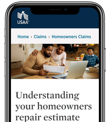
This project was initiated to address the challenges users faced in understanding home insurance estimates. The need arose from frequent calls to customer service about claims status and home insurance estimates. My team was asked to create a long-form article that would help users comprehend their insurance estimates more effectively, thereby reducing calls, increasing digital engagement, and enhancing member satisfaction and confidence.
Problem Statement
Users needed to understand how to read and interpret their home insurance estimates to manage their claims independently and efficiently.Homeowners struggled to comprehend their insurance estimates, leading to confusion and frequent calls to customer service.
Business Problem: High volume of claims status calls, low digital engagement, and reduced member satisfaction.
Insights
We designed for homeowners, aiming to meet their needs for clarity and ease in understanding insurance estimates. Our research, including an unmoderated UserZoom study with 16 participants (including 2 USAA members), revealed key user needs:- Clear breakdown of estimate details
- Definitions of terms used in estimates
- Easy access to FAQs and additional resources

Hypothesis
We hypothesized that providing a comprehensive, easy-to-understand article with examples, definitions, and FAQs would reduce the number of calls to customer service, increase digital engagement, and improve user satisfaction.
Goal
Our goal was to create a long-form article that would enable users to:- Easily find information on how to read a home insurance estimate
- Submit an insurance estimate for their claim online
- Discover a video on how to read home insurance estimates

Solution
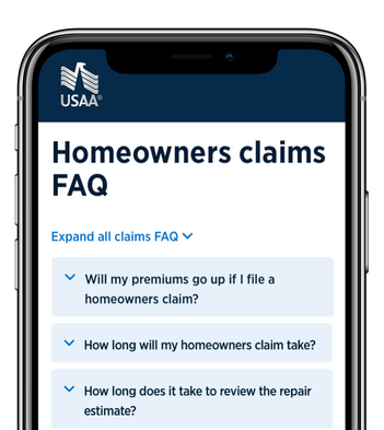
The solution involved creating a detailed article that included:- Step-by-step instructions on reading a home insurance estimate
- Examples of estimates with clear definitions of each line item
- An FAQ section addressing common questions
- Jump links for intuitive navigationMy involvement included conducting user research, designing the information architecture, creating user flows, and developing wireframes. We iterated on these designs based on user feedback to ensure clarity and ease of use.

Final Design
The final design evolved through several iterations. We tested various layouts and content structures, incorporating user feedback to enhance readability and usability. The final article featured:- A clear, logical structure
- Examples and definitions integrated within the content
- Intuitive jump links for easy navigation
- A comprehensive FAQ section

Learnings
We evaluated the solution through follow-up questionnaires and observed user interactions during the study. The key outcomes included:- Increased user confidence in understanding their estimates
- Reduced number of calls to customer service
- Positive feedback on the clarity and usefulness of the article
" Review the estimate overview gives you a quick snapshot of your policy coverage details, including coverage types deductible, and policy limits for the claim. This seems really easy to follow, the coverage section shows the type of items covered by your policy such as your home or belongings." – User #25
"That's one of the things that I appreciate about USAA. They actually take the time even if it is in the FAQ section to explain so that you're confident in the knowledge that you have. Or at least know what questions you should be asking.” - User #14
Summary
The project successfully met its goals, providing users with the tools they needed to understand their home insurance estimates. Key learnings included the importance of clear examples and definitions, and the value of a well-organized FAQ section. If given more time or resources, we would conduct further testing to refine the design and explore additional digital tools to enhance user engagement.

About
H&R Block's A Fair Shot program returns in 2023 to champion gender equity in NIL deals and highlight tax implications. In collaboration with Fabletics and Jambys, the initiative addresses unequal NIL sponsorships for female student athletes. Following its successful debut, the program now celebrates 50 athletes across 13 sports, including underrepresented areas. It also expands to NCAA Divisions II and III, plus Historically Black Colleges and Universities, aiming to promote fairness and inclusivity. My team and I were tasked with creating a campaign landing page website to amplify these efforts.
Problem Statement
The desired outcome is to promote gender equity in sports by providing female student-athletes with equal NIL opportunities and awareness of tax implications.Female student-athletes face unequal opportunities for NIL (Name, Image, and Likeness) sponsorships, limiting their potential for financial and professional growth.
Insights
We were designing for female student-athletes who needed equal opportunities in NIL deals and a clear understanding of the tax implications. Through user interviews and market research, we identified that many female athletes lacked awareness and resources to secure NIL deals and manage the associated taxes. This data underscored the need for a dedicated platform to address these gaps.
Hypothesis
By creating a comprehensive digital platform, we believed we could enhance the visibility of female student-athletes, educate them on NIL opportunities and tax implications, and ultimately promote gender equity in sports sponsorships.

Goal
We aimed to inform our audience about the selected athletes, share their stories compellingly, and increase engagement through social media and the athletes' personal channels.
Solution
To solve the problem, we developed a campaign landing page that:Showcased selected athletes and their achievements.
Provided educational resources on NIL opportunities and tax implications.
Leveraged social media to amplify the athletes' personal brands.
Design Process
Site Map: Created a clear and intuitive site structure.
Wireframes: Designed wireframes to map out key elements and user flows.
Layout Concepts: Developed layout concepts to ensure a visually appealing and user-friendly interface.
Final Design: Iterated on feedback to refine the design, ensuring it met all user needs and business objectives.


Learnings
We evaluated our solution through user feedback and engagement metrics. The project successfully increased awareness of NIL opportunities and provided essential tax information to female athletes. Our goals were met, with increased website traffic and social media engagement.
Summary
The project was a success in promoting gender equity in NIL deals. We learned the importance of continuous user feedback and iterative design. With more time or resources, we would further enhance the platform's educational content and expand its reach to more athletes and institutions.

Credits
Creative: Kenzie Tubbs, Jose Arellano, Trevor Stark, Roberto Perez Jr., Shayla Gordon, Becky Blackman
Insights: Kate Michel, Brooke Minor
Adobe Target: Mike Tolin
Web Authoring: Rachel Nyp, Natalie Morgan, Matt Roiz, Mike Clifton

About
The Block Advisors website needed to better communicate trust, expertise, and approachability—especially during high‑traffic seasonal moments like tax season. Existing pages were functional, but the storytelling and visual consistency varied across sections, making it harder for users to quickly understand how Block Advisors could support their specific tax needs.Key challenges included:Inconsistent visual language across sections and campaignsLimited flexibility for seasonal and promotional contentOpportunities to better guide users through complex tax services with clearer narratives
Goals
- Refresh key website sections to strengthen brand consistency and clarity- Support seasonal campaigns with flexible, scalable design patterns- Explore and validate new components for the evolving design system- Improve content hierarchy to better tell a story of guidance, confidence, and expertise
My Role & Responsibilities
I worked closely with product, marketing, content, and engineering partners to:- Design seasonal and evergreen website content for Block Advisors- Explore new layout patterns and components aligned with the design system- Create high‑fidelity mockups and production‑ready assets- Iterate based on stakeholder feedback and real‑world constraints- Ship approved designs live to production
Process
1. Content & Narrative AlignmentI collaborated with content and marketing partners to understand seasonal priorities and user intent. Together, we focused on framing Block Advisors as a trusted partner—someone who simplifies tax complexity for individuals and small business owners.2. Design System Exploration- Using the existing design system as a foundation, I explored:- New section layouts for service overviews and landing pages- Flexible content modules that could adapt to seasonal messaging- Updated typography, spacing, and visual hierarchy for improved readability- These explorations helped inform future design system updates while remaining feasible for engineering.3. Iteration & Validation- Designs went through multiple rounds of review with stakeholders. I refined layouts based on:- Brand and accessibility standards- Content clarity and scannability- Responsiveness across breakpoints- Several concepts were approved and ultimately launched live on the site.
Solution
The final work resulted in refreshed website sections that:- Presented a more cohesive and confident Block Advisors brand- Used clearer content hierarchy to guide users through tax solutions- Supported seasonal campaigns without sacrificing consistency- Balanced marketing needs with long‑term system scalability
Artifacts
For this case study, I showcase:- Live, approved website sections that launched during my time at H&R Block- Seasonal campaign designs that demonstrate flexibility within the design system- High‑fidelity explorations that influenced future patterns and layoutsThese artifacts highlight both shipped work and forward‑thinking explorations grounded in real business needs.
Impact
- Improved visual and narrative consistency across key Block Advisors pages- Faster turnaround for seasonal content through reusable design patterns- Stronger storytelling around how Block Advisors supports individuals and small businesses


Reflection
This work reinforced the importance of designing within constraints—balancing brand, system consistency, and seasonal urgency. It also strengthened my ability to collaborate across marketing and product teams while shipping real, customer‑facing experiences at scale.

Credits
Creative: Kenzie Tubbs, Jose Arellano, Trevor Stark, Roberto Perez Jr., Shayla Gordon, Becky Blackman
Insights: Kate Michel, Brooke Minor
Adobe Target: Mike Tolin
Web Authoring: Rachel Nyp, Natalie Morgan, Matt Roiz, Mike Clifton

About
In the early months of 2023, our team received a request to revamp the homepage of Spruce, a mobile banking app committed to giving users a financial makeover. Our objective was to craft a new homepage design that not only showcased the core features of Spruce but also directed users toward creating an account. Through thorough research and analysis of user behavior on the existing homepage, our team developed multiple versions for moderated user testing, followed by A/B testing on the live site. Over a span of six months, we continuously refined the design through iterations, ultimately producing a homepage experience that effectively embodied the Spruce brand, highlighted key features, and significantly boosted the conversion rate for account sign-ups.
Problem Statement
The desired outcome was to provide users with a clear understanding of Spruce’s features and benefits, ultimately encouraging them to create an account.
Insights
We were designing for prospective users of Spruce, aiming to address their financial management needs. Our research, which included user testing and analysis of current user behavior, revealed that users were struggling to understand what Spruce offered and how it could benefit them. We prioritized these needs based on user feedback, engagement metrics, and conversion rates.

Hypothesis
We hypothesized that by creating a more user-centric homepage, clearly showcasing Spruce’s features and benefits, we could increase user engagement and conversion rates for account sign-ups.

Goal
Our goal was to enhance the homepage to better inform users about Spruce’s offerings, thereby increasing the conversion rate for account sign-ups.

Solution
To solve the problem, we embarked on a comprehensive design process:Information Architecture: We restructured the homepage to prioritize essential information and make navigation intuitive.
User Flows: We mapped out user journeys to ensure a seamless experience from landing on the homepage to signing up.
Wireframes: We created wireframes to visualize the new layout and gather initial feedback.
Design Tools Used: Figma, Miro, UserTesting


Final Design
Our final design involved multiple iterations based on user feedback and testing data. We developed three unique homepage versions and tested them with users, collecting qualitative and quantitative insights.


Learnings
Qualitative Insights: User feedback highlighted the importance of clear messaging and visual hierarchy.
Quantitative Insights: We measured success through A/B testing, focusing on conversion rates and page engagement.
From May 30 to July 20, we observed the following results:Default: 22% conversion rate
Budget Tracking: 21% conversion rate
Relationship: 22% conversion rate
All-in-One: 25% conversion rateThe "All-in-One" marquee performed the best, with users appreciating the unique features and automation capabilities it offered.
Summary
This project taught us the importance of clear, user-centric design and iterative testing. The project met its objectives, significantly improving user understanding and engagement with Spruce. If we had more time or resources, we would further refine the designs based on additional user feedback and explore more personalized user experiences.
Credits
Creative: Kenzie Tubbs, Jose Arellano, Trevor Stark, Roberto Perez Jr., Shayla Gordon, Becky Blackman
Insights: Kate Michel, Brooke Minor
Adobe Target: Mike Tolin
Web Authoring: Rachel Nyp, Natalie Morgan, Matt Roiz, Mike Clifton

About
At Sam’s Club, we’re committed to becoming the membership you love most. To achieve this, we aimed to provide excellent products and services – in clubs, online, and through mobile devices – across the U.S. and Puerto Rico. The need arose to enhance our digital presence and user experience, so our team was tasked with creating in-app campaigns, branded style guides, landing pages, and site placements for top-tier brands and service partners.
Problem Statement
Our goal was to improve user engagement and drive sales through better digital experiences.Sam's Club members were having difficulty navigating and finding relevant products on our digital platforms, leading to reduced engagement and sales.
Insights
We designed for a diverse user base that includes mobile and web users. Our research showed that users needed a seamless, consistent experience across devices. User feedback and analytics data indicated that the current digital experience was fragmented and not user-friendly, leading us to prioritize ease of navigation, accessibility, and visual consistency.

Goal
Our goal was to enhance the user experience on Sam’s Club digital platforms, thereby increasing user engagement, driving sales, and generating leads.
Solution
- Created in-app campaigns featured on samsclub.com for top-tier brands and service partners.
- Collaborated with the design team using style guides to ensure consistency and refresh the look and feel of our seasonal site placements on our website and mobile app.
- Designed ADA-compliant ads that were accessible on various devices for both Android and iOS.The ideation stages included developing information architecture, user flows, and wireframes to map out user journeys and ensure seamless navigation.

Final Design
The final design evolved through multiple iterations, incorporating user feedback and usability testing. The result was a cohesive, user-friendly digital platform with consistent branding and improved accessibility.


Learnings
We evaluated our solution through both qualitative feedback from users and quantitative data from user engagement metrics. The improvements led to increased user engagement and sales, validating our approach.
Summary
This project taught us the importance of consistent user experience across all digital platforms. The project met its goals, but with more time and resources, we would further refine the user flows and conduct more extensive user testing to continue enhancing the experience.

About
eBay is an inspired marketplace that fuels passion and celebrates individuality as users shop, sell, and discover their perfect version. It’s what makes us Uniquely eBay. We create, refine, and innovate user experiences across multiple platforms. We believe in designing intentional, useful, and elegant products that we're proud of and our customers love.
Major Tasks & Responsibilities
Create in-app campaigns featured at eBay.com for top-tier brands and Service partners.
Design Tools Used
Photoshop, Illustrator, Sketch, & InDesign
High-Fidelity Prototype
Branded Pages


About
In 2018, I joined ABM Industries to create a team website for their janitorial staff at Facebook in Menlo Park, CA.
The team website was much needed by the janitorial staff and management team to be efficient with communication, collaboration, and work tasks. This website would also enable ABM staffing to onboard a recruiting process to fully staff all Facebook campuses to meet their janitorial and event needs.
Problem Statement
My role was to research, ideate, design, user test, and develop the team Website. This project could not have been possible without the feedback and support of ABM operations, talent & development, management, and hourly staff to make this website possible.
Insights
We designed for a diverse user base that includes mobile and web users. Our research showed that users needed a seamless, consistent experience across devices. User feedback and analytics data indicated that the current digital experience was fragmented and not user-friendly, leading us to prioritize ease of navigation, accessibility, and visual consistency.
Role
My role was to research, ideate, design, user test, and develop the team Website. This project could not have been possible without the feedback and support of ABM operations, talent & development, management, and hourly staff to make this website possible.
Tasks & Responsibilities
Research, storyboard, sketch, wireframe, prototype, user test, and develop Team website
Design Tools / UX Methods Used
Photoshop, Illustrator, Sketch, InVision, & User Testing
Process
- Highlight the most common patterns
- Identifying the overlap opportunities
- Define our design principles
- Define design teams' needs
-Define front end-to-end teams' needs
- The system support & communications iterative process
Personas
To empathize with the different types of users, we developed personas based purely on experience and assumptions. These serve as a starting point to reflect on the user's needs and challenges and possible solutions that can be considered later in building the information architecture.


Information Architecture
To use information architecture effectively, I first analyze my content and understand my users' needs and behaviors. Then, I create a hierarchical structure, implement metadata and tagging systems for enhanced searchability, and regularly review and refine the IA based on user feedback and evolving content requirements.

UX Audit
To understand the old site and its content, I ran a content audit listing all available information and features. Based on this, my team and I collectively decided what to keep, what to remove, and how content can be integrated into more intuitive information architecture.

Sitemap
The site map enabled me to organize holistically the pages of the website. I also worked with some colleagues to determine where pages would be located on our home menu. Pages were organized by importance and priority to each of the team's needs.


Visual Style Guide


Final Compositions


Learnings
I learned that having a diversity of users involved early in designing workflows was effeciive. The project had many challenges; the most difficult part was finding ways to create an ecosystem that has various user journeys all in one place to bring team members together to be more collaborative and efficient to meet their business needs. After creating the website and keeping all digital and available files on the web, our onboarding process time was cut by 65%. We saw a better retention rate and better staff by the 3rd quarter of 2018.

Context
Shopkick is an engaging shopping reward app in the United States. The platform connects digital and physical retail with beacon technology and rewards millions of users across the full path to purchase for actions such as walking into stores, scanning products, browsing content, and making purchases in-store and online. As a production designer at Shopkick, I worked with major retailers and brands, creating in-app campaigns that provided exclusive rewards to Shopkick users to increase product in-store and online sales.
Tasks & Responsibilities
Create in-app campaigns featured in the Shopkick app for significant brand and retail partners.
Design Tools Used
Photoshop, Illustrator, Sketch, & InDesign
Email Ads
Below is an example of an email banner I created for new partner launches, such as Torrid. These promotions were essential for informing loyal users to continue to visit these retailers and make the most of their shopping.
Email banners also help users be engaged in contests as well as a variety of select dates where they can earn more kicks of their in-store engagement.

In-App Promo Ads
Some of my work consisted of creating brand and retail lookbooks filled with content such as recipes, nutritional information, as well as insights in regard to product use and benefits. We also included video ads to be displayed in our app for users to be aware of new products as well as earning kicks to redeem gift cards.


In-App Lookbooks
I also created in-app banners that included offers to encourage users to pick items from the shelf and scan them to redeem kicks. Kicks are available when the user makes a purchase and scans their receipts. Users can also walk to partnered stores and get kicks for stepping into the store to encourage users to view more products available for more offers.

In-App Promotions
At Shopkick, I created a wide variety of in-app campaigns by which I also included web views. These web views are roadmaps to earning more kicks and making the most of purchases.
On special occasions, users could win a lot more based on their shopping expenses. These ads also include dates as well as limited-time offers.


Context
Reel Code is an app that allows users to unlock cool features such as ordering food, Making Fan Store Purchases, Fan Trivia, and more. It keeps fans engaged and aware of what Levi’s has to offer all in the palm of your hand. My role was to research, design, and test all user interfaces related to the project. I collaborated with design, product development, and engineering to launch this project.
Tasks & Responsibilities
Develop the UI to showcase as a demo to potential investors
Design Tools / UX Methods Used
Sketch, Flinto, InVision, Cardsorting, A/B Testing
Design Process
Our Product and marketing team researched what technology was available at Levi’s Stadium and other local venues in the Bay Area. We discovered that a lot of time, promotions, and services are not implemented in digital form. Knowing that there is full Wi-Fi coverage around the stadium, there is an opportunity to give attendees a digital experience.
Our Product and Engineering team created a digital experience for the San Francisco 49ers by implementing a branded barcode that would be scanned by our Reel Code Media app. Users can unlock four features that could be available for Levi’s attendees. These barcodes would be labeled on every seat at Levi’s Stadium, and users would be able to order food, purchase fan gear, participate in half-time trivia and view quarter-to-quarter game highlights.
Personas
Based on the storyboard, we identified and created two personas to us help us focus on and think holistically to prevent our own desires for features from trumping the user's needs.


Wireframes
Creating wireframes provided usability to the forefront in showcasing page layouts at their core. It promoted ease of use, conversion paths, naming of links, navigation placement, and feature placement. Wireframes can point out flaws in your site architecture or how a specific feature may work.


Low Fidelity Concepts

Final Compositions

Learnings
Based on my user research, I was surprised by how much utility a mobile app can provide users at a sports venue. Users appreciated the ability to have instant experiences such as ordering food and merchandise, participating in trivia, and watching quarterly videos and highlights.
Key Performance Indicators (KPIs) such as increased user engagement, higher transaction rates, and improved customer satisfaction underscored the success of these features.
I enjoyed going on-site to Levi’s Stadium and seeing where our QR codes would be present for users to scan the custom barcode and engage with our app features. Tracking KPIs such as the number of scans per game and the conversion rate from scans to interactions provided valuable insights into the effectiveness of our on-site implementation strategy.